
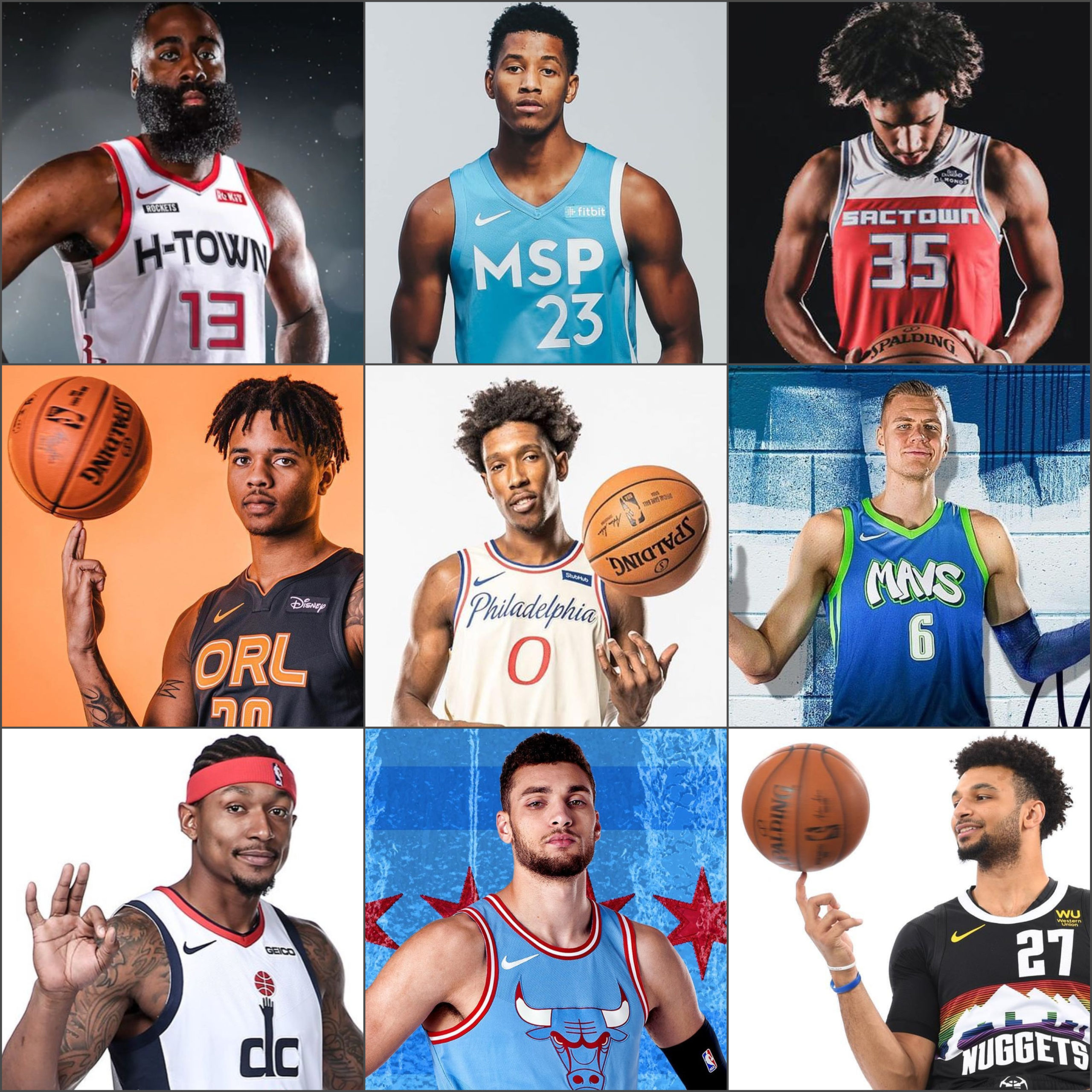
These are the NBA City Jerseys for the 2019-20 season. We tell you why this jersey was made and what we grade the jersey as.
ATLANTA HAWKS
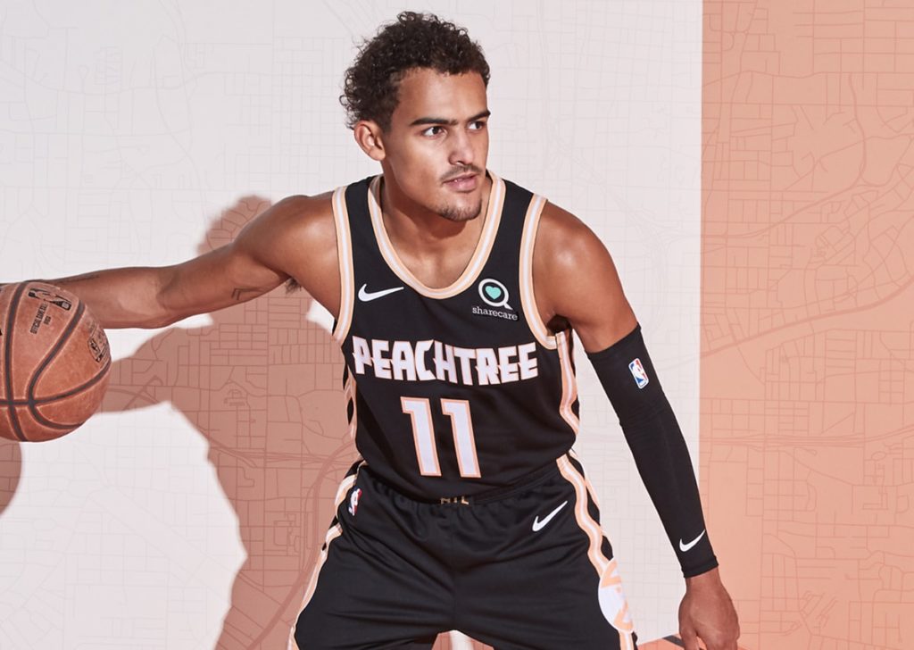
The Hawks ¨Peachtree¨ jersey is referring to the famous Atlanta street. This jersey feature peach-colored stripes on the edge of the jersey, with the foundation of the jersey being black. The outlines of the ¨Peachtree¨ jersey are also in peach. Atlants does have a second court themed for when the Hawks play in this jersey.
OVERALL GRADE-B+
BOSTON CELTICS
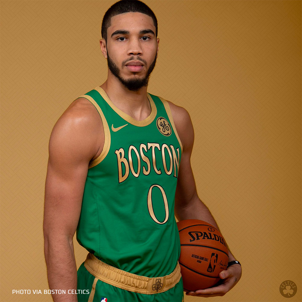
The Celtics are obviously one of the more historic teams in the NBA, and they haven’t really changed the design of their jerseys much. You can’t blame them. This jersey is a green jersey, with the Boston part being in gold. The waistband features the special ¨shamrock¨ leaf. The numbers on this jersey are also in gold, bringing a little excitement to this jersey. We like this jersey because it is something special, and it doesn’t ruin much of the traditional jersey look for Boston.
OVERALL GRADE-C
BROOKLYN NETS
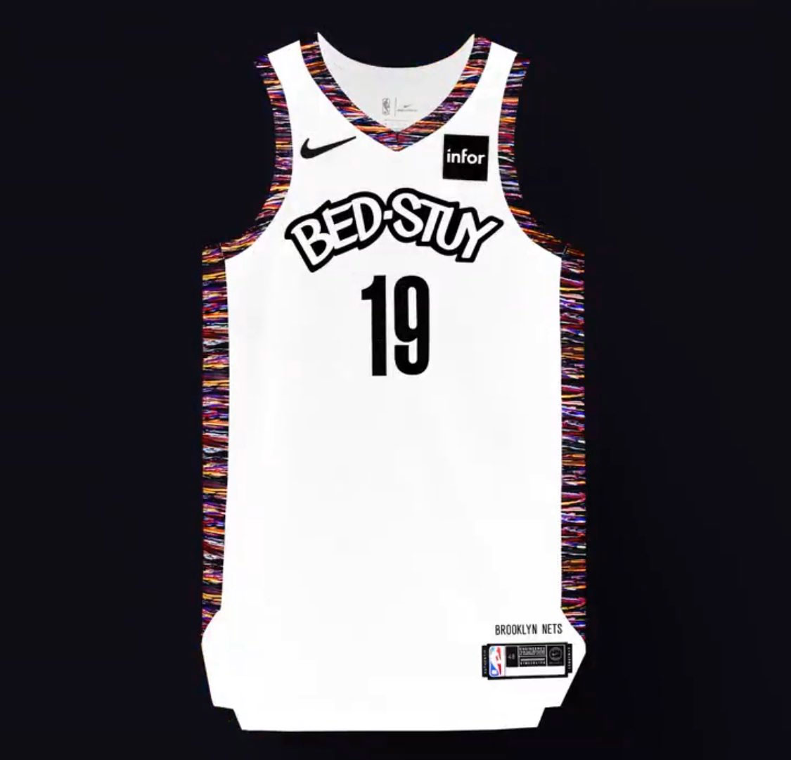
Brooklyn´s city edition jersey features the ¨Bed-Stuy¨ design, a nickname for the famous Bedford–Stuyvesant neighborhood in Brooklyn. This jersey is white, white colorful stripes on the side. There are many reasons to like and dislike this design. The font of the Bed-Stuy part could be a little better, but overall not bad with the idea.
OVERALL GRADE-C+
CHARLOTTE HORNETS


These jerseys trace back to the colonial history of the United states. This is when a British general referred to a county in the area as a hornets nest. These jerseys symbolize this by telling the league that the Hornets will swarm and the opponents will get swarmed. From our point a view something better could have easily come from this especially when your owner is Micheal Jordan. The Hornets will feature a throwback jersey this year, along with a throwback court, for when they wear the throwback jersey.
OVERALL GRADE-D
CHICAGO BULLS
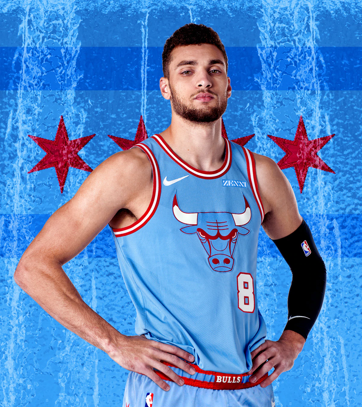
This jersey symbolizes the history of the city and its waterways. It unites the city together and gives the remainder and feeling of family. This jersey has a clean look to it with the blue color along with the red stripes outlining it. Although this jersey looks cool it is very simple and doesn’t really have that much going on.
OVERALL GRADE-B
CLEVELAND CAVALIERS
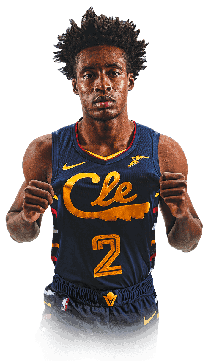

This jersey honors the Cavs history while also showing this is the team of the future. The contrast of the navy and the gold color symbolizes the championships Cleveland won. These jerseys are very clean and even have a feather like CLE wordmark on it. This is a throwback for the cavs and is a great way to show the teams 50th anniversary. Cleveland will have an alternate court representing the city jersey.
OVERALL GRADE-B-
DALLAS MAVERICKS
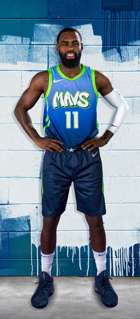

This jersey is a for sure no. The Mavs are not a 10-year old team here. The past two years, the Mavs have had nice design for their city edition jerseys, but this year, no way. The graffiti font does not look well with the light blue/green. Light green is not the right color for the outlines of this jersey. The youth may enjoy wearing this jersey to support their team, but that is a for sure no-no on the court. Dallas has a second court, themed when the Mavericks wear their city edition jersey. The midcourt logo will be a little green, floor looks a little different. The paint looks neat, with a light blue fading into black.
OVERALL GRADE- D-
DENVER NUGGETS

The Nuggets bring back the rainbow skyline jerseys, except now, it’s in a black form. The rainbow pattern is a tribute to the jerseys worn early on, although here, they have modernized the font, making the design look newer. Overall, its a nice design, with a modern touch.
OVERALL GRADE- B
DETROIT PISTONS

Although many people would dislike this jersey because they say it looks like a soccer jersey, we don’t. This design is a red jersey, with blue stripes going down the middle with ¨Motor City¨ written across it, representing Detroit. Yes, the design could have been better, but not a bad jersey overall. Last year, they had the same design, except with a metallic look. Improvement could be used in this jersey, but not bad.
OVERALL GRADE- D
GOLDEN STATE WARRIORS
The Warrior’s jerseys pay homage to their time at Oakland, which also symbolizes their championship run. The Oakland tree represents the famous Oakland Tree. The silversides represent the bay area bridges. This jersey’s symbolism shows its class and beauty for the city of Oakland. Golden State will feature two different courts this year. One of them will be for when they wear ¨The Town¨ jersey, and the other for the classic ¨San Francisco¨ jersey.

This is the city edition court-

This design is for the classic night court, a tribute to San Francisco.
OVERALL GRADE-C
HOUSTON ROCKETS

This is one of the top jerseys that represent their city very well. The H-town jerseys for the Rockets are known to show city pride. These jerseys represent the city’s connection for space exploration with the white and silver spacesuit like jersey. H-town is a connection to the city’s popular nickname. We like these jerseys because they are simple yet clean. They represent a big part of the city while also looking sleek.
OVERALL GRADE- C
INDIANA PACERS
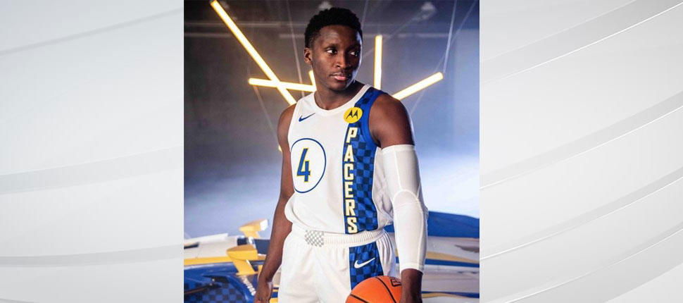
The Indiana Pacers feature a city jersey that is simple, and interesting. This jersey is a tribute to the city´s legacy of auto racing. The blue stripe with a square pattern is the representation of a finish line. The simplicity of this jersey is alright, could have added a little more. We think that the Motorola logo could be a little smaller, as it looks too big of a sponsor on the jersey.
OVERALL GRADE-C
LOS ANGELES CLIPPERS
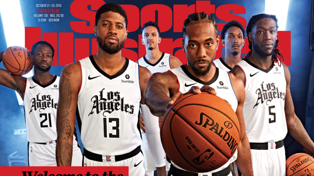
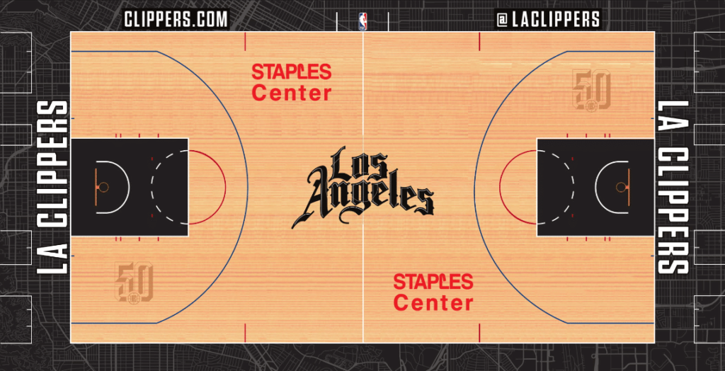
The Clippers debuted their 2019-2020 city edition jersey on the cover of Sports Illustrated. It looks a little boring but goes with their 50th anniversary colors. They do have a city edition court this year, not too different than the normal court. Overall, we wish that there was a lot more to this jersey, maybe next year will be better.
OVERALL GRADE-C-
LOS ANGELES LAKERS
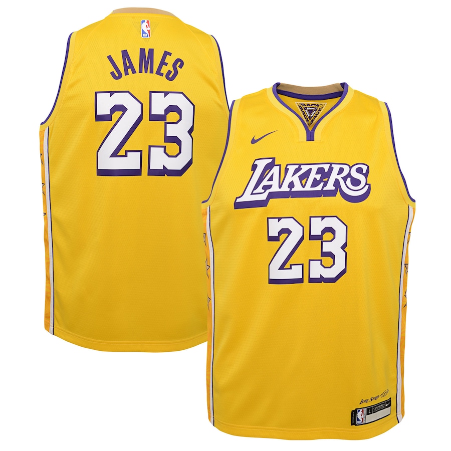
Like the Celtics, the Lakers are one of the more traditional teams of the NBA, therefore they don’t change up the new designs from the original one. The city edition jersey is yellow, with the number and the ¨Lakers¨ part being in white.
OVERALL GRADE-B-
MEMPHIS GRIZZLIES


This year, Memphis is the only NBA team without an official City Edition Jersey. But, they have a classic jersey. This jersey is a throwback to when they were known as the Vancouver Grizzlies. The colors are completely different than the normal Grizzlies jerseys, but they don´t look bad at all. The jersey is a teal color, with Vancouver Grizzlies written on it. This year, the Grizz will have a court for their classic jersey. The midcourt logo will be of the Grizzly with the basketball in its hand. The colors of the court aren’t bad either. The classic jersey can’t be changed for any team, but this is probably one of the better classic designs out there.
OVERALL GRADE-B+
MIAMI HEAT

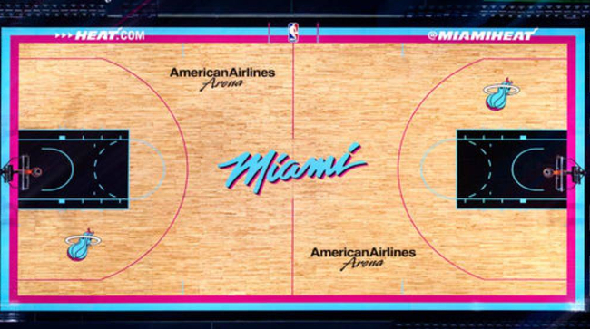
Wow. The City Edition Jersey for the Miami Heat once again looks incredible. The Heat didn’t change the design much from last year, going with the Miami Vice colors. This year´s jersey is a light blue color, with the Miami part in white, and the numbers in magenta. This jersey looks very clean, and there is nothing we would change about it. Miami will have a city edition court, nothing too fancy. Overall, we love this jersey, one of the best city jerseys this year.
OVERALL GRADE-A
MILWAUKEE BUCKS

The Bucks´ city jersey theme this year¨Cream City¨. The jersey is cream-colored, with the numbers in green. This is a simple jersey, nothing too special. Milwaukee is called Cream City because of the light colored bricks throughout the city. Not much you can say about this jersey, other than that it is bland.
OVERALL GRADE-B
MINNESOTA TIMBERWOLVES
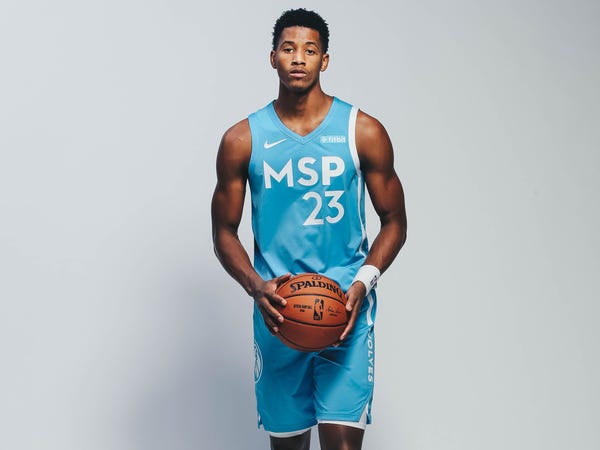
This year, the Timberwolves came with a baby blue jersey, and the MSP initials on it. I think here, the T-Wolves are trying to represent both Minneapolis and St. Paul? Anyway, this jersey looks fresh, not bad. The colors don’t really blend with the traditional Timberwolves colors, but it’s something different. Overall, not bad, it looks like a nice, simple jersey to wear in game.
OVERALL GRADE-C
NEW ORLEANS PELICANS
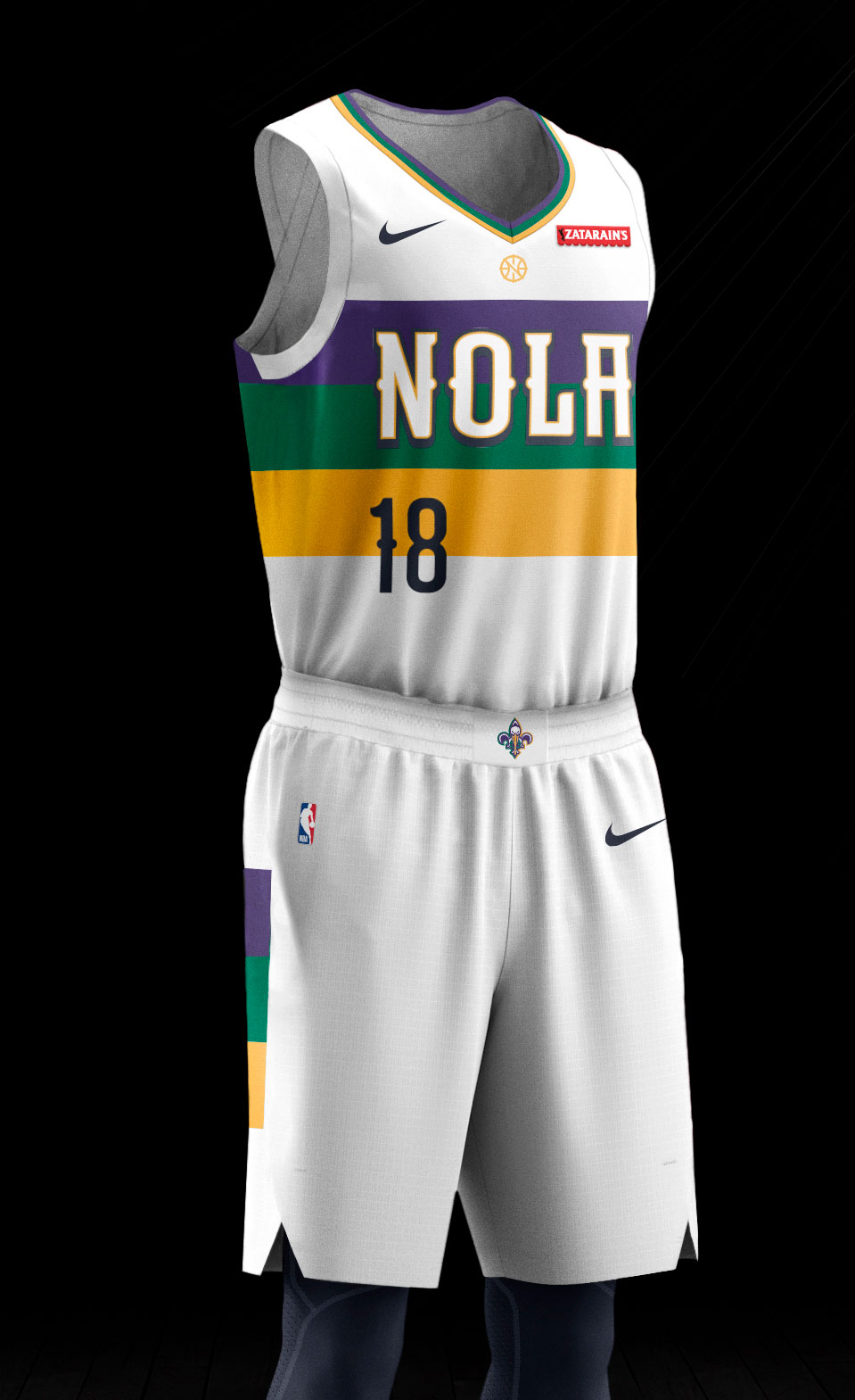
For the second straight year, the Pelicans´ City Jersey is Mardi Gras themed. This jersey is white, with stripes of purple, green, and gold; with NOLA written across it. The shorts also have stripes.
OVERALL GRADE-B-
NEW YORK KNICKS
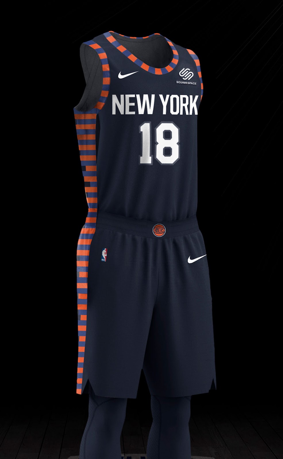
Look, the Knicks aren´t a good team, but you gotta admit, their city edition jerseys don’t look too bad. The horizontal stripes represent the New York skyline. The jersey is dark blue, other than that, the only other design is the stripes. Some people may not love this jersey, but we like it. Overall, we are going to give this a B because of how good it looks, yet it is a very simple jersey.
OVERALL GRADE-B-
OKLAHOMA CITY THUNDER

This year, Oklahoma City is paying tribute to the lives lost in the OKC bombing in their city edition uniform. But, it just doesn’t seem right with their colors. The jersey is charcoal-colored, with a gold block going down the sides. If the jersey was near the colors of the Thunder, then it would look a lot better on them, but not this year. The Thunder did a great job with the theme of this year´s jersey, but from a color and design standpoint, it doesn’t look too good.
OVERALL GRADE-D
ORLANDO MAGIC
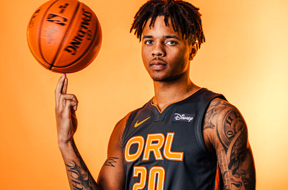
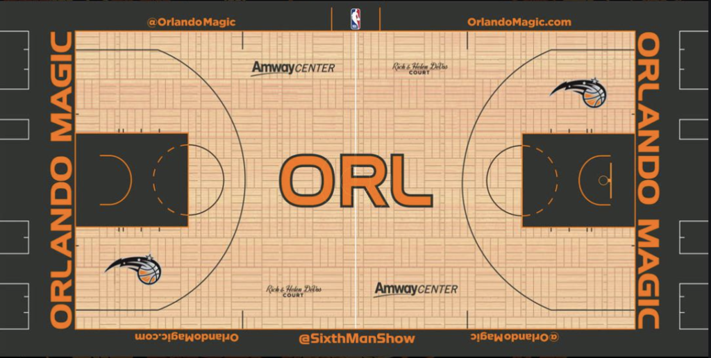
The gray and orange colors of the Orlando Magic city edition uniform refer to the citrus industry of Orlando. The Magic (like the Thunder) have different colors on their city edition uniform, contrast to their normal blue and white colors. The jersey is deep gray, with the ORL in orange, across the chest of the uniform. Overall, this jersey is a meh, the design is boring, and they could make the tribute of this uniform more clear.
OVERALL GRADE- B-
PHILADELPHIA 76ERS
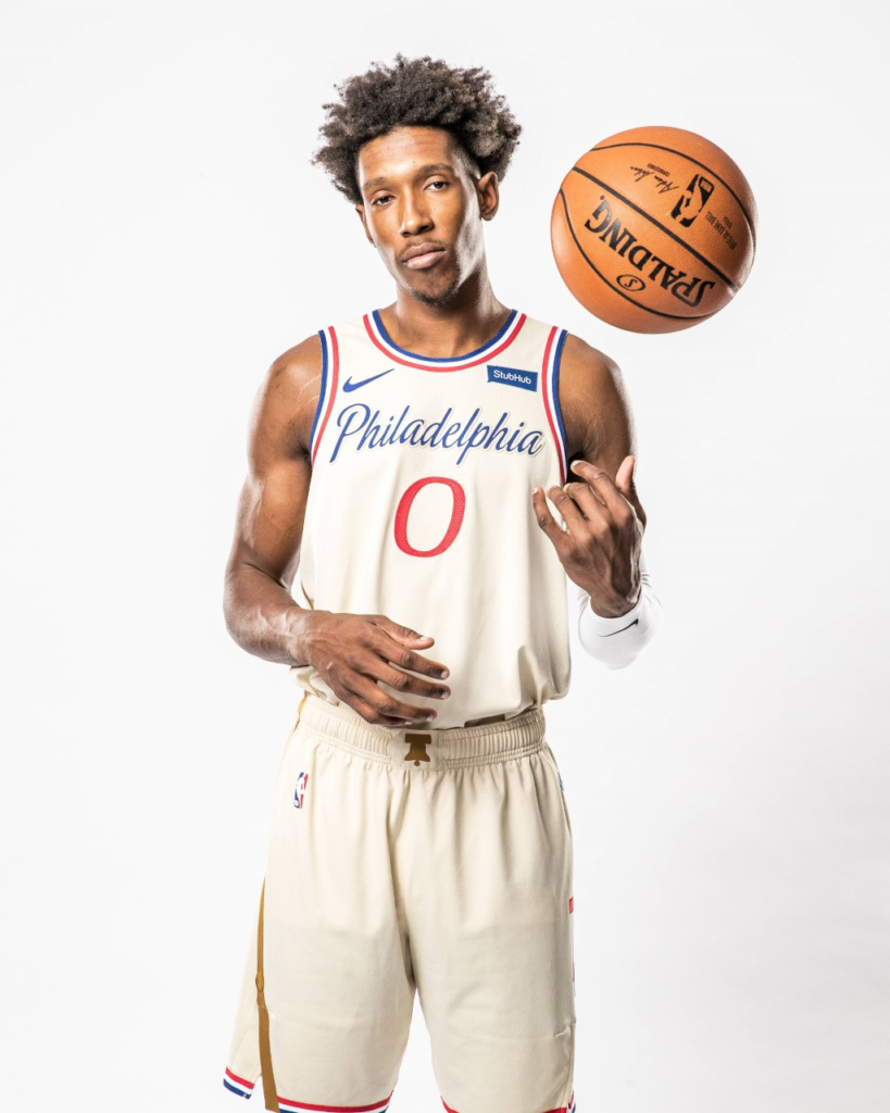
The Sixer’s jersey is based on the spirit of dedication from the past and present. The jersey is based on the constitutions parchment paper for the main color of the jersey. The jersey’s stripes are from the crack at the famous Liberty Bell. This jersey turned out fantastically for the 76ers as they are clean and symbolistic. The parchment-like color really brings out the rest of the jersey making a nice design.
OVERALL GRADE-A
PHOENIX SUNS

The Sun’s jerseys are based on the incomparable sunsets they have in the state of Arizona. While also paying tribute to the influence that Mexican culture has. The Sun’s jersey looks pretty sleek, but also could be better. Since the main color was black I was expecting more from these jerseys besides the orange and purple.
OVERALL GRADE-C
PORTLAND TRAIL BLAZERS


The war cry for the Trailblazers forever, Rip City. The phrase has been around in Portland forever and they have a lot of pride in the name. Since the team is celebrating its 50th anniversary, the jersey is a perfect representation. Rip City is such a big part of a city and these jerseys tell the city story perfectly. The color wave is pretty nice with the white bringing out the red letters.
OVERALL GRADE-B+
SACRAMENTO KINGS


The Kings have changed colors of the city edition jersey from last year, going from baby blue to red. This jersey is red all the way below from the chest, with the ¨Sactown¨ written across this chest. We think that last year´s baby blue jersey looked better, but the red doesn’t look too bad either. This year, the Kings will have the red and blue court when they wear the city and classic uniform, and will also feature a court for when they wear their alternate uniforms.
OVERALL GRADE- B-
SAN ANTONIO SPURS

Basically, every year now the San Antonio Spurs have gone with the camouflage jersey for their alternate or city edition. Never changing it up. They’ve gone with this design for years, and have not stopped. Really hoping that they will change it up sometime in the future, but for now, it doesn’t look like it.
OVERALL GRADE-D
TORONTO RAPTORS
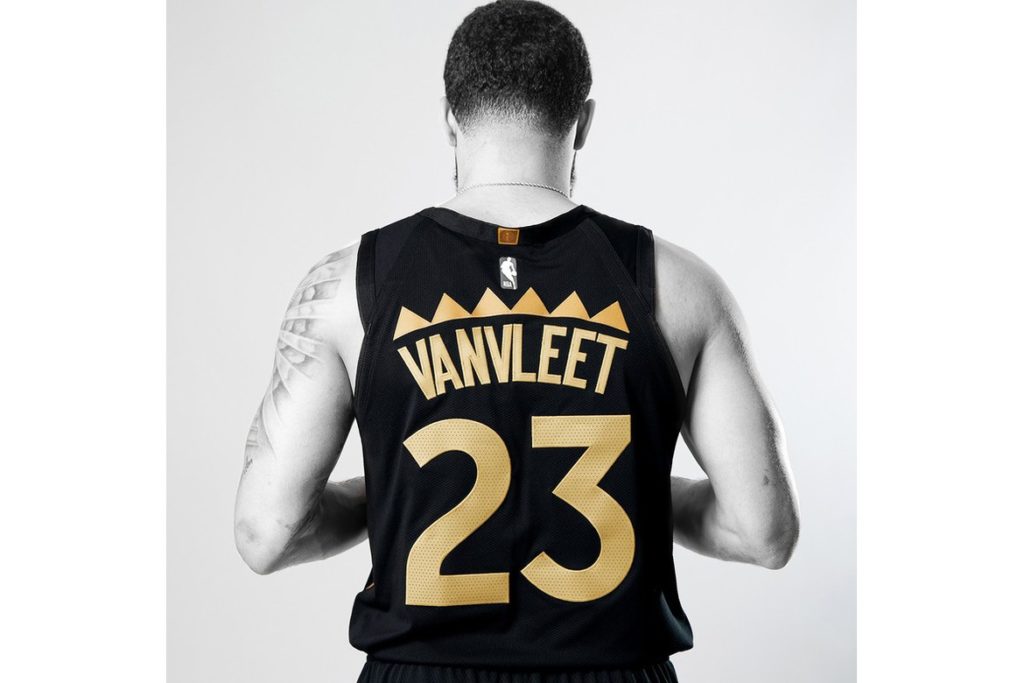
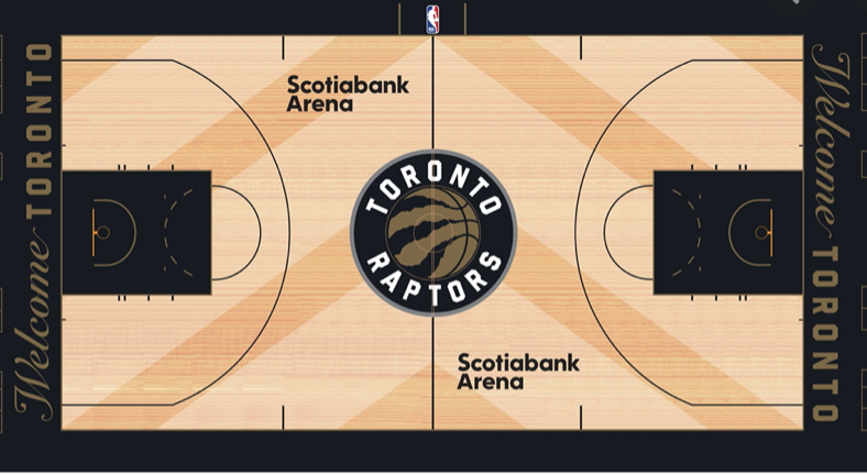
The Raptors´ city edition uniform is one of the best out of all the teams. The jersey is black, with Toronto written in gold across the uniform. This jersey is a tribute to their recent successes´, The Raptors bring back the gold to their uniforms, and we think it looks a lot better this year. Toronto will have a court themed for the city edition uniform, and will also have a court themed for their throwback night. Not bad for the North.
OVERALL GRADE-A
UTAH JAZZ


The new Utah jerseys are the warm colors are based on the rock formations that show the landscape. The highways in Utah run down the sides of the jersey as well. The warm color really brings the white letters that show the team and player names. The jerseys are pretty cool overall and also show a representation of parts of the city that are important.
OVERALL GRADE-B+
WASHINGTON WIZARDS
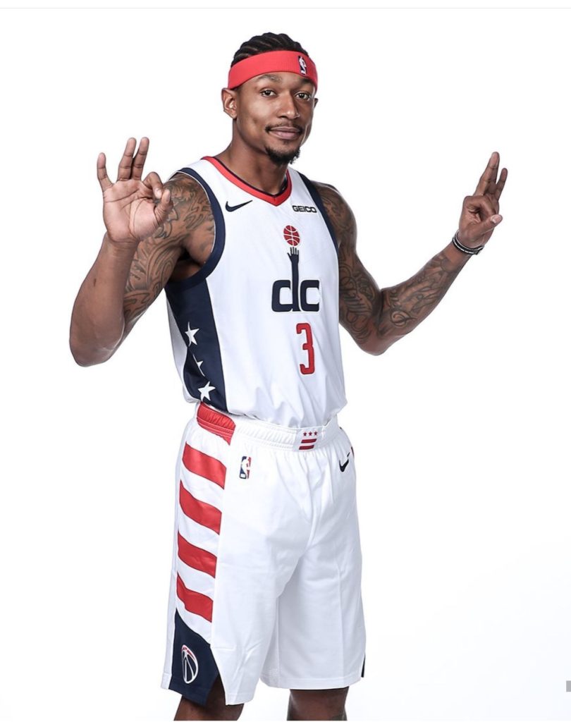
The Wizards city uniform doesn’t look much different from the regular home jersey. This uniform has the stripes of the U.S. going down the shorts and D.C. written on the center of the jersey. This jersey is a good representation of the nation’s capital team, but we aren’t fans of this, as there could have been more design and color for this jersey.
OVERALL GRADE-C-